A kitchen that’s designed with real living at the heart of
it, is a kitchen that’s built for life. At Life Kitchens we take a very down to earth approach to this
philosophy in everything we do. For us, planning your kitchen is all about understanding
you, your life, and the way that you live it. That’s why each and every Life
kitchen is entirely unique, and tailored to you from start to finish.
We’re passionate about offering something for everyone and
delivering the highest quality craftsmanship in every kitchen; with styles
ranging from the ultra-contemporary through to the timelessly classic, and
everything in between. With this in mind, we caught up with our head of design,
Graeme Smith, to discover the inspiration behind our six latest kitchen looks –
all dedicated to helping you re-imagine life in your kitchen.
Welcome to the first two looks in our collection
– SEAMLESS and STRUCTURED.
SEAMLESS
A welcoming kind of contemporary
“There’s often the perception that sleek and contemporary
means stark, white, and overly minimal. However, our SEAMLESS look has been
designed to embrace sleek modern living while injecting warmth and statement
character throughout the whole space.
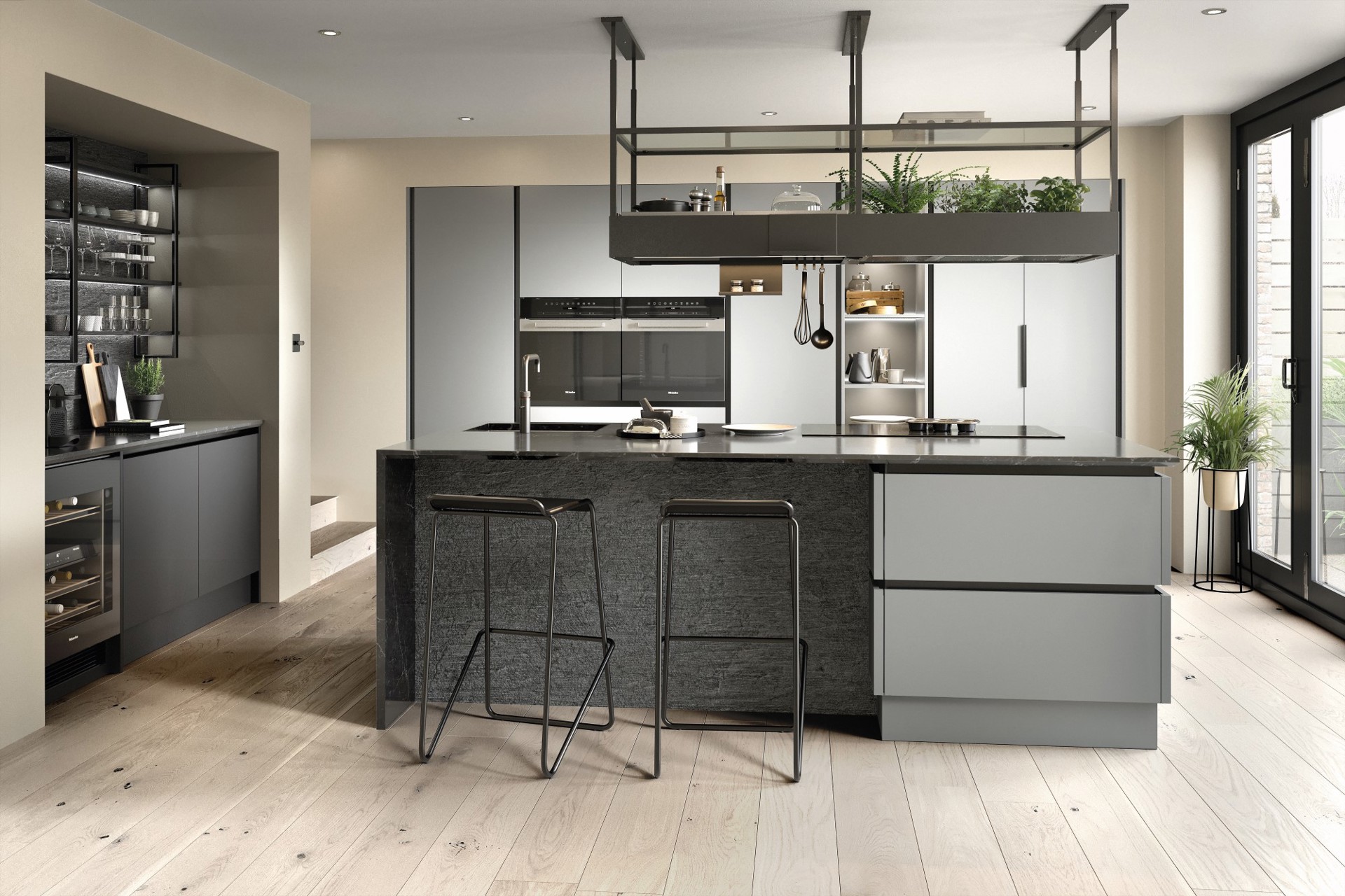
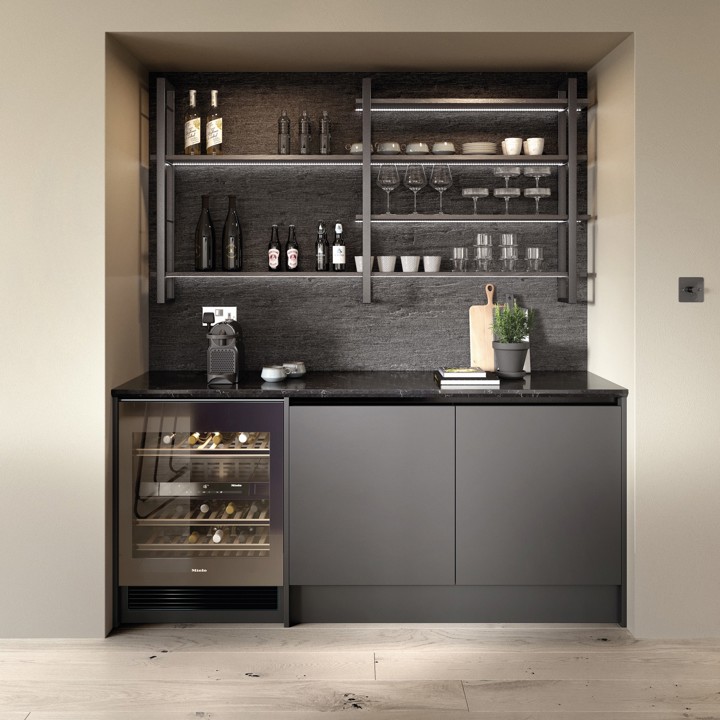
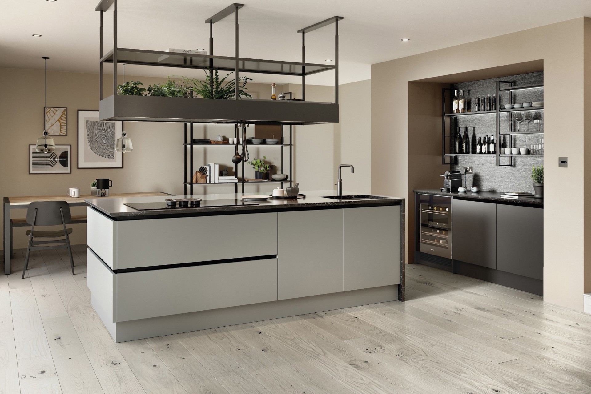
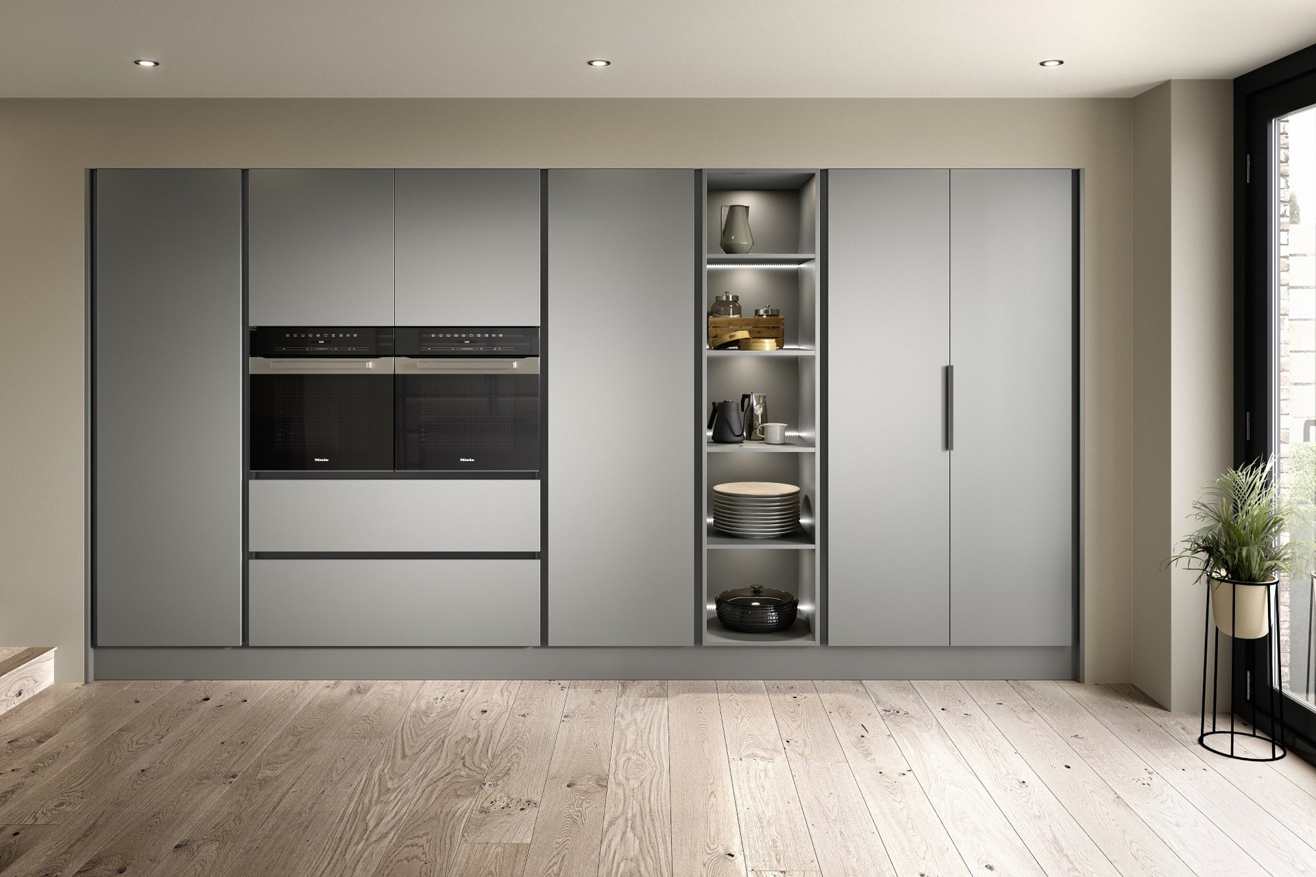
The handleless cabinetry in a soft, mid-toned
Dust Grey effortlessly radiates light across the room. It keeps everything airy
while providing the perfect backdrop to go deeper in places with measured drama
and texture; the Burnt Ash island and bar insets, deep veined worksurfaces,
exposed shelving, and grid-like handleless trims.”
Designed for real living
“The trick here is to soften this kind of look with
greenery, a glassware display, or a few of your most treasured items. Despite
the showstopping features, this highly social, open plan look has been designed
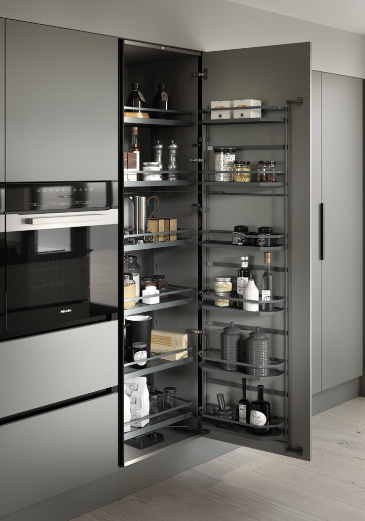
with absolute practicality in mind; full height larders, integrated appliances,
and a function-driven island with sink, hob and smart storage the whole way
round.”
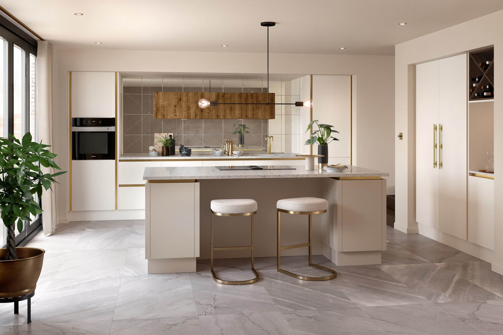
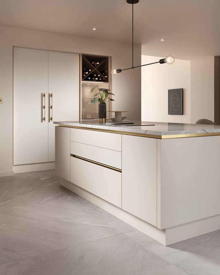
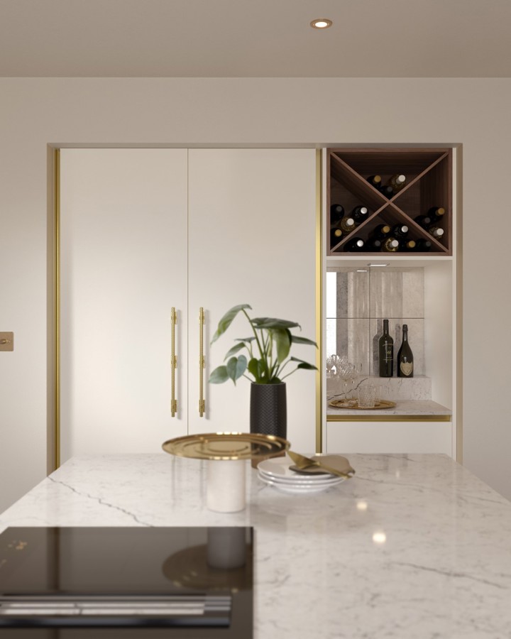
Sleek and seamless can be glamourous too
“A simple, handleless look can just as equally exude
glamourous elegance if you’d prefer. Easily achieved through the careful
selection of a warm neutral such as Cashmere, seen here paired with Mid-Oak
feature cabinets, beautiful brass accents, and antique mirror styling.”
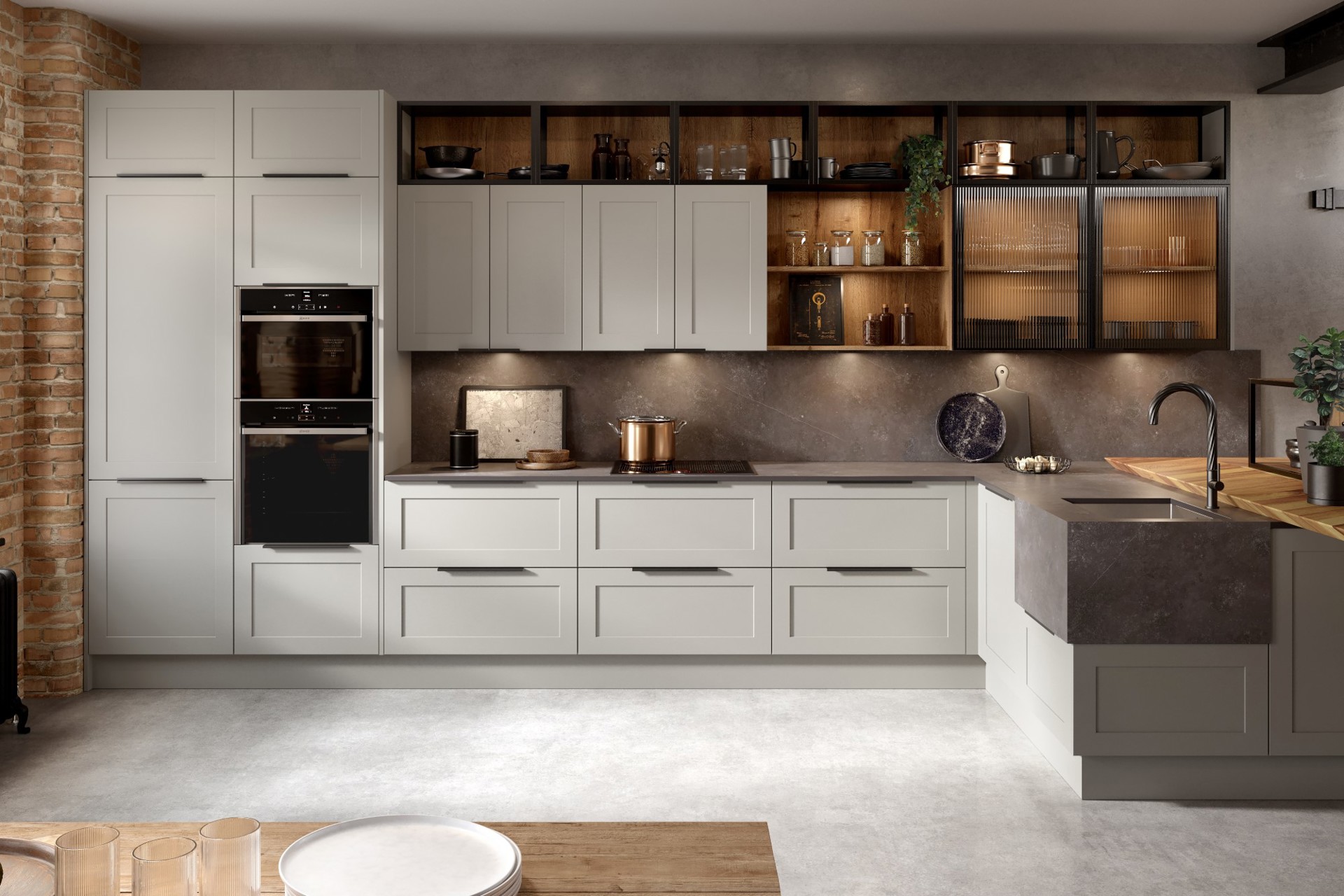
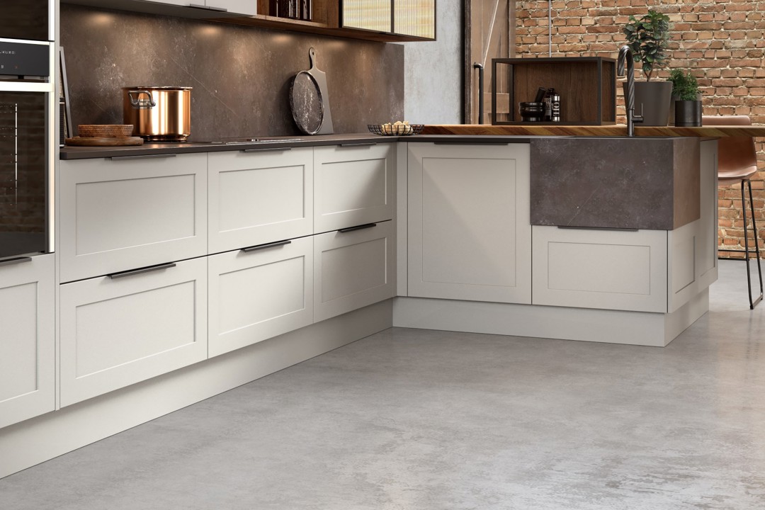
A classic take on industrial heritage
“There are no hard and fast rules when it comes to the
design of your kitchen, and it’s absolutely possible to create a unique blend
of your favourite styles. Whilst industrial looks can often be considered extremely
modern and exposed, our STRUCTURED look shows how industrial features can be
paired beautifully with softer classic design.
Keeping everything light and slimline is the key
to holding this look together. Usually quite classic and solid in style, this
Shaker cabinetry appears modern thanks to its narrow door surrounds and black
trim handles that almost disappear. Equally, the strong concrete-style
worksurfaces are super-slim in depth, with a fine spider veining for weightless
delicacy.”
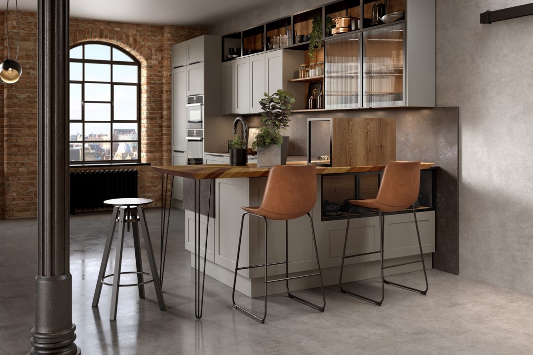
Layer it up
“It’s really important to achieve the right balance when two
opposing styles come together. Go bold in places with features like black metal
open shelving, industrial style lights, taps and furniture. But in contrast, layer
this over lighter, matt cabinetry - seen here in Putty, adjacent to textured woodgrain
insets to add warmth and interest at different levels. You’ll also notice that
the floor and walls blend seamlessly into the cabinetry – a top tip for keeping
a look like this light and open”.
We hope we’ve helped to inspire life in your kitchen. Explore the inspiration behind the other looks in our latest collection here:
HOMELY and RELAXED | VIVID and LUXE
![5 Clever Small City Kitchen Ideas [Colours, Design and Lighting]](https://innkeeper.pws.co.uk/lifekitchens/media/timeless-a.jpg?width=720)
.png?width=720)
